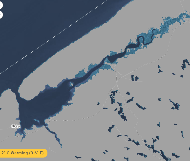
Some folks seem to think that the maps we have been presenting that show projected sea rise at various locations around the Bay of Fundy represent some imminent change. They don't. They are designed to show what can be expected if global warming reaches certain levels of temperature rise.
With regards to timing, the authors say: "When do we pass the point of no return, and lock in the future sea levels shown? Maps that compare temperature increases show sea level projections that lock in IF AND WHEN enough carbon emissions add up to lock in each temperature increase. The answers depend on our carbon choices, and could easily fall within this century for any of the temperature options."
So it depends on us. If we can meet the challenges posed by global warming, sea levels may not be as severe as those shown. If we don't meet the challenge, the most certainly will!
The full explanatory text follows:
*************************************************************************************************
Reading Sea level timing is critical for a clear understanding of when the sea level rise shown on these maps could occur in the future. These maps are based on peer-reviewed scientific research led by Benjamin Strauss and Scott Kulp of Climate Central in collaboration with Anders Levermann of the Potsdam Institute of Climate Impact Research, and published in Proceedings of the National Academy of Sciences of the United States of America. Application of this research to areas outside the U.S. is detailed in the Mapping Choices report.
These notes are intended to help explain the research, the maps, and how to use them.
Sea level lock-in
Carbon pollution casts a long shadow. It is expected to persist in the atmosphere long enough to prolong temperature increases for hundreds and thousands of years, long after we stop burning fossil fuels or clearing forest. And the seas will continue to rise.
That’s what these maps are about. They do not show what sea levels will be in this century (see this map for near-term analysis). What they do show are scientific projections, taken from this paper, of the different post-2100 sea levels that could lock in this century, depending upon the carbon pathway we select. The areas colored blue are the areas below